Solutions
Package Loading
As mentioned within the session setup, load the following packages using the library() function.
  library(tidyverse)
  library(RColorBrewer)
  library(ghibli)
  library(palettetown)
Exercise 1: Using the data provided (ex1.dat), generated by the code below, plot the data onto a scatterplot using ggplot(). Plotting the variable sine from the data onto the x variable, and the index (1:1001) onto the y variable
Setup Code
# Generate the sequence 1 to 100, in steps of 0.1
  ex1.dat <- as.data.frame(
    seq(from = 0,
        to = 100,
        by = 0.1))

# Apply the sine function
  ex1.dat <- sin(ex1.dat)

# Rename the columns
  colnames(ex1.dat) <- "sine"
Solution
  ggplot(data = ex1.dat,
         mapping = aes(x = 1:1001,
                       y = sine)) +
    geom_point()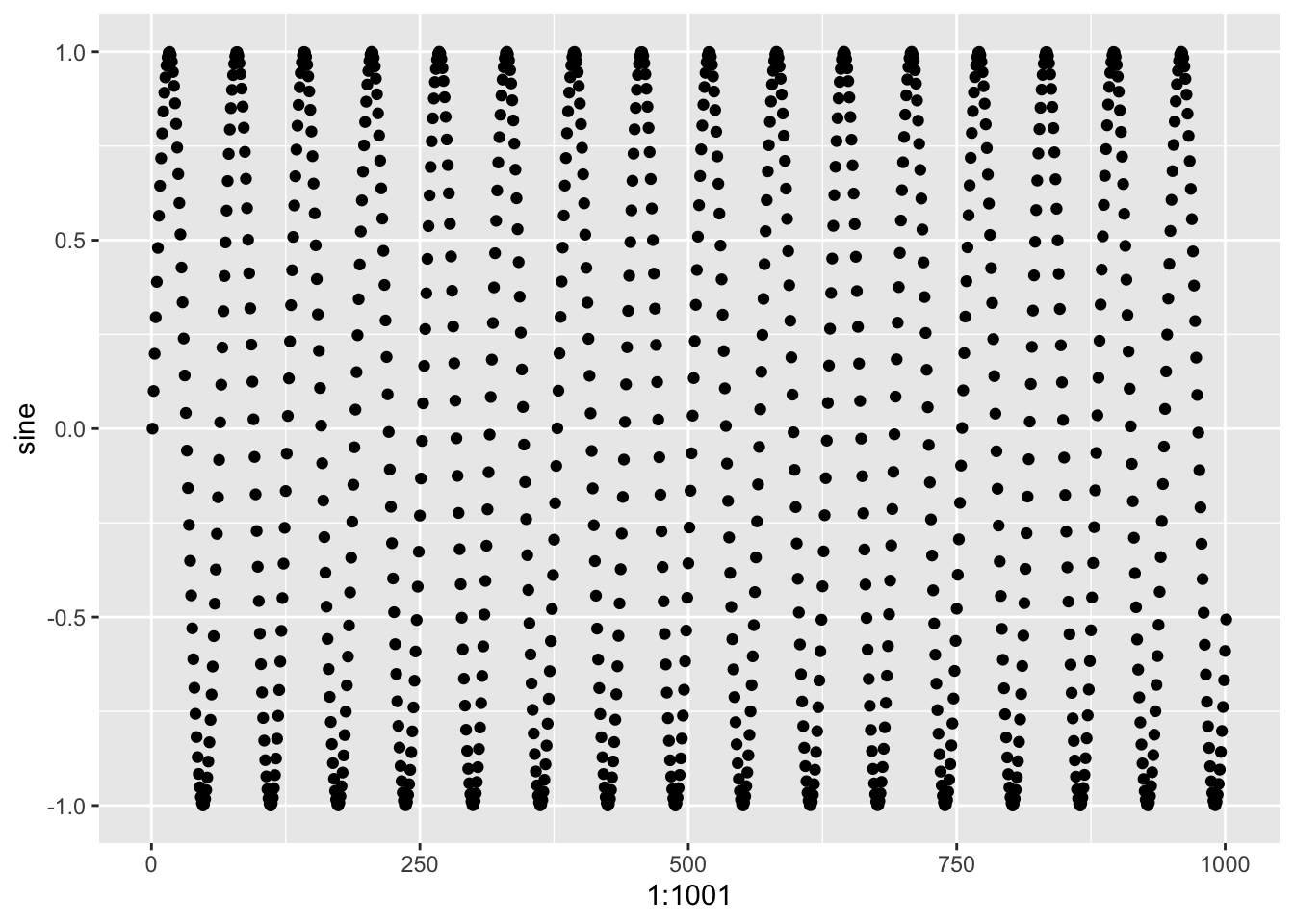
Exercise 1, Bonus Question: Rather than using geom_point(), use geom_line() or another geom_ function to plot this same data in another way.
  ggplot(data = ex1.dat,
         mapping = aes(x = 1:1001,
                       y = sine)) +
    geom_line()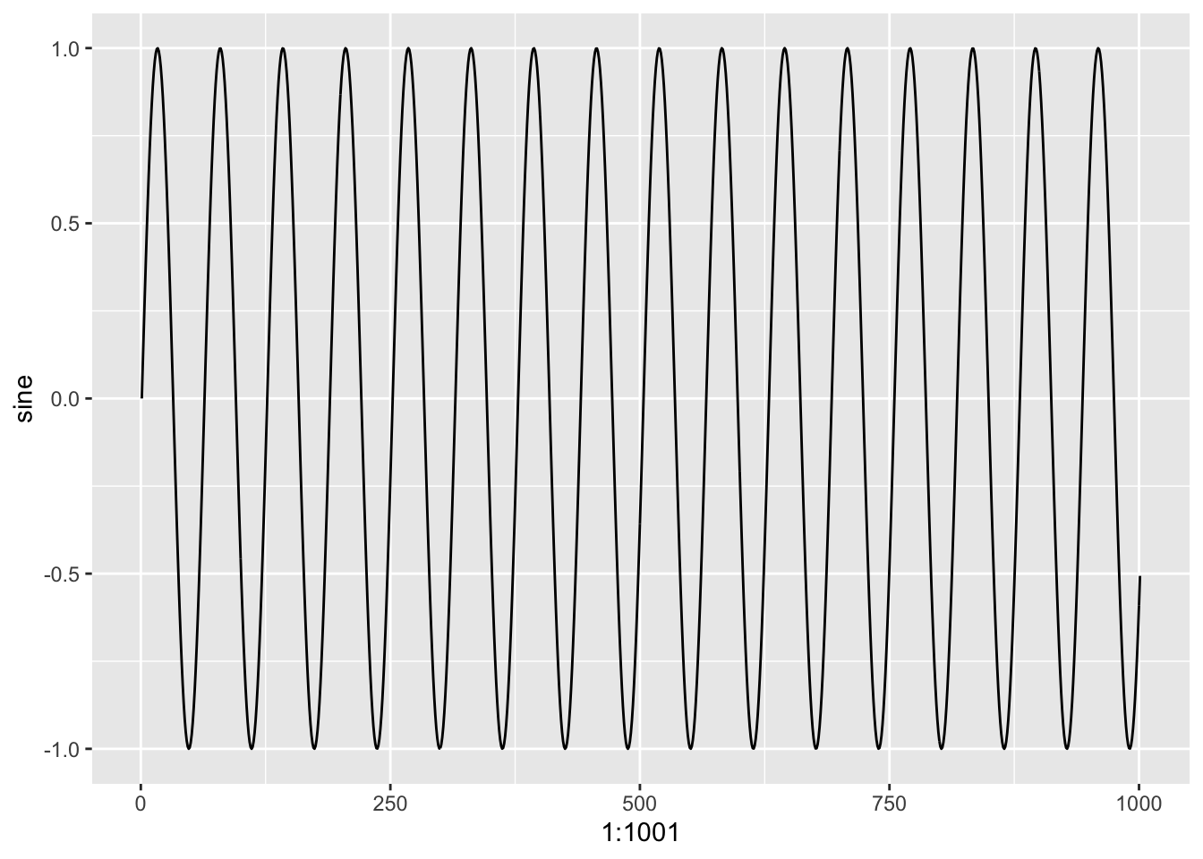
Exercise 2: Add one of the two following themes to clean up your code!
  ggplot(data = ex1.dat,
         mapping = aes(x = 1:1001,
                       y = sine)) +
    geom_point() +
  theme_void()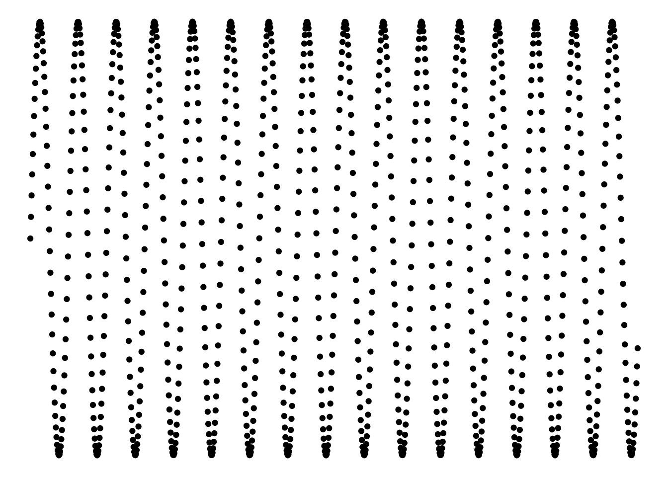
Exercise 3/Bonus: Combined Mathematical Sequences, Using the same data as before (ex1.dat) transform the data and layer it onto the previous plots. Use the geom_line() function to more easily observe the impact of this transformation.
  ggplot() +
    geom_line(data = (ex1.dat + 1),
            mapping = aes(x = 1:1001, y = sine)) +
    geom_line(data = (ex1.dat - 1),
            mapping = aes(x = 1:1001, y = sine)) +

    geom_line(data = (ex1.dat * 2),
            mapping = aes(x = 1:1001, y = sine)) +

    geom_line(data = (ex1.dat / 2),
            mapping = aes(x = 1:1001, y = sine)) +

    theme_void()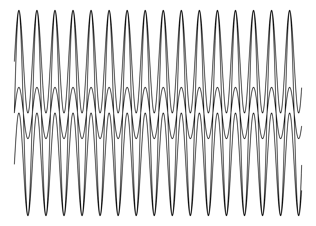
Exercise 4: Changing Coordinate System
ex4.dat <- as.data.frame(seq(from = 1,
                                 to = 51.3,
                                 by = 0.1))
    ex4.dat <- sin(ex4.dat)
    colnames(ex4.dat) <- "sine"

ggplot(data = ex4.dat,
         mapping = aes(x = 1:504,
                       y = sine)) +
    geom_point() +
  theme_void() +
  coord_polar()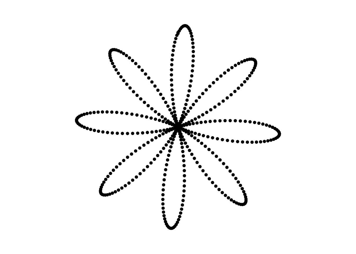
Exercise 4, Bonus
ex4.dat <- as.data.frame(seq(from = 1,
                                 to = 51.3,
                                 by = 0.1))
    colnames(ex4.dat) <- "seq"
    ex4.dat$sine <- sin(ex4.dat$seq)
    ex4.dat$cos <- cos(ex4.dat$seq)
    ex4.dat$tan <- tan(ex4.dat$seq)

ggplot(data = ex4.dat) +
    geom_point(mapping = aes(x = 1:504, y = sine)) +
    geom_point(mapping = aes(x = 1:504, y = cos)) +
    geom_point(mapping = aes(x = 1:504, y = tan)) +
  theme_void() +
  coord_polar() +
  ylim(-1, 1)
## Warning: Removed 251 rows containing missing values (geom_point).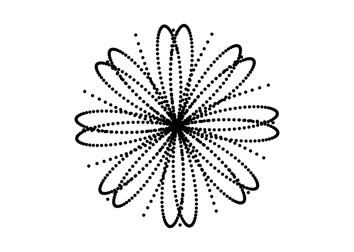
Exercise 5: Layering Colours, using the code created in Exercise 4, replace geom_point() with geom_polygon() and apply a colour within using fill = or colour =.
ggplot(data = ex4.dat) +
    geom_polygon(mapping = aes(x = 1:504, y = sine), fill = "blue") +
  theme_void() +
  coord_polar() +
  ylim(-1, 1)
Exercise 6: See inspiration for ideas about what you could do!